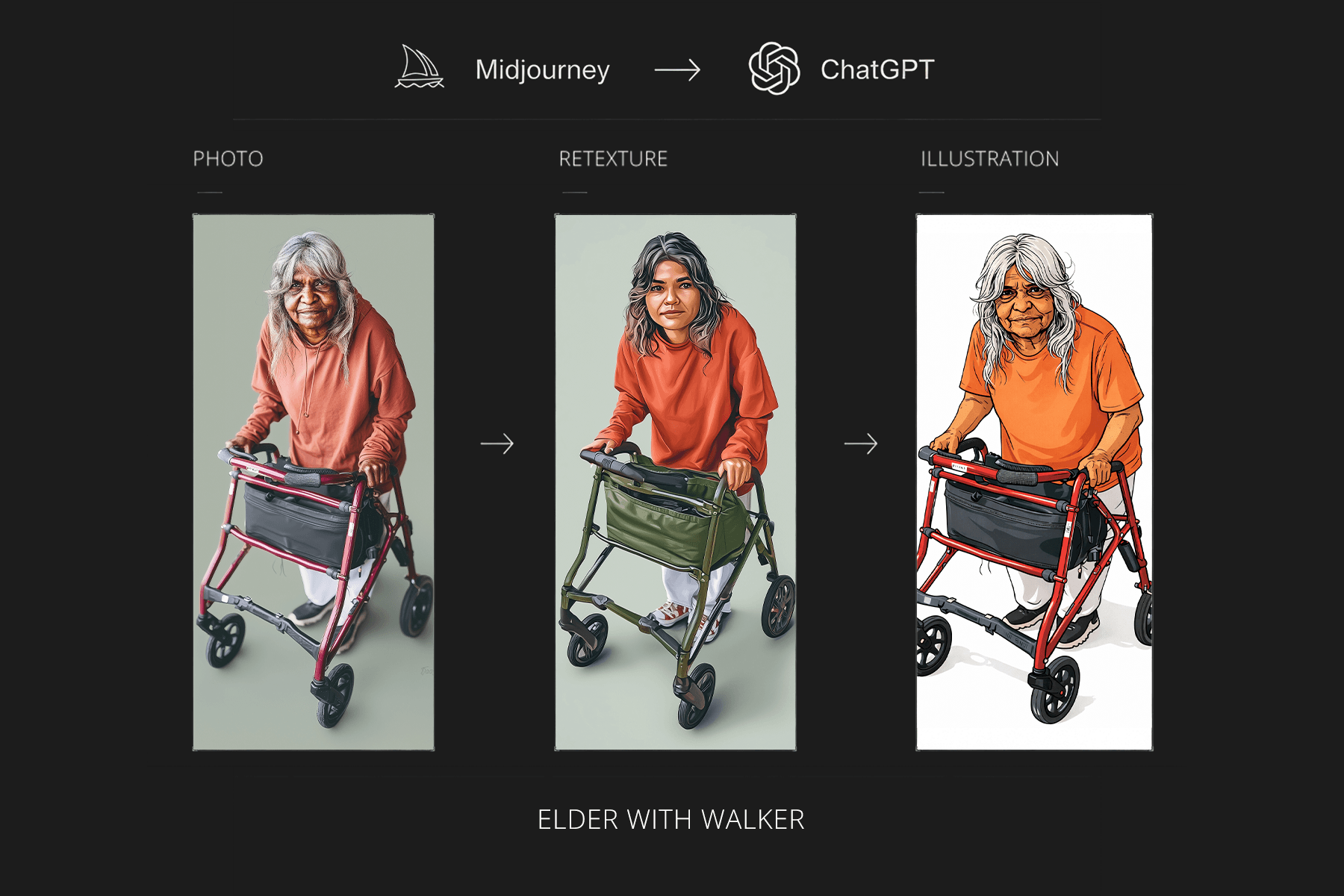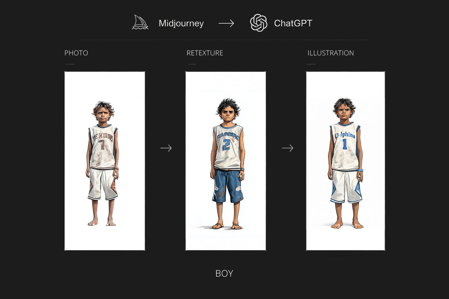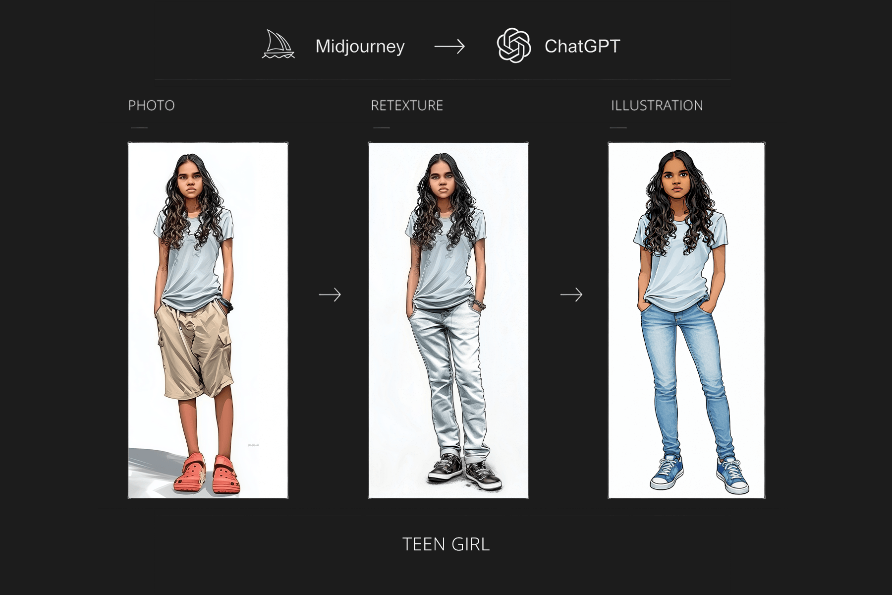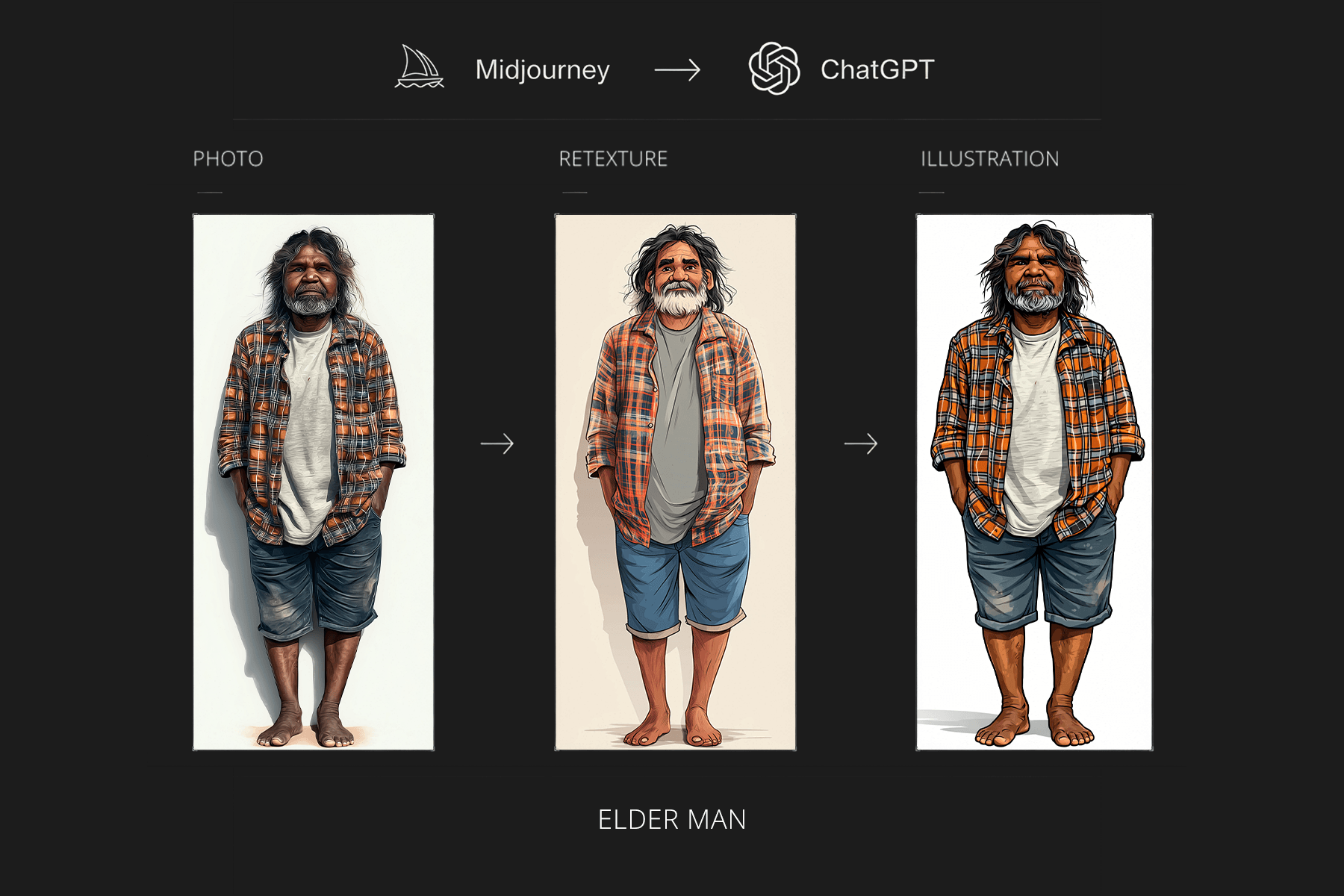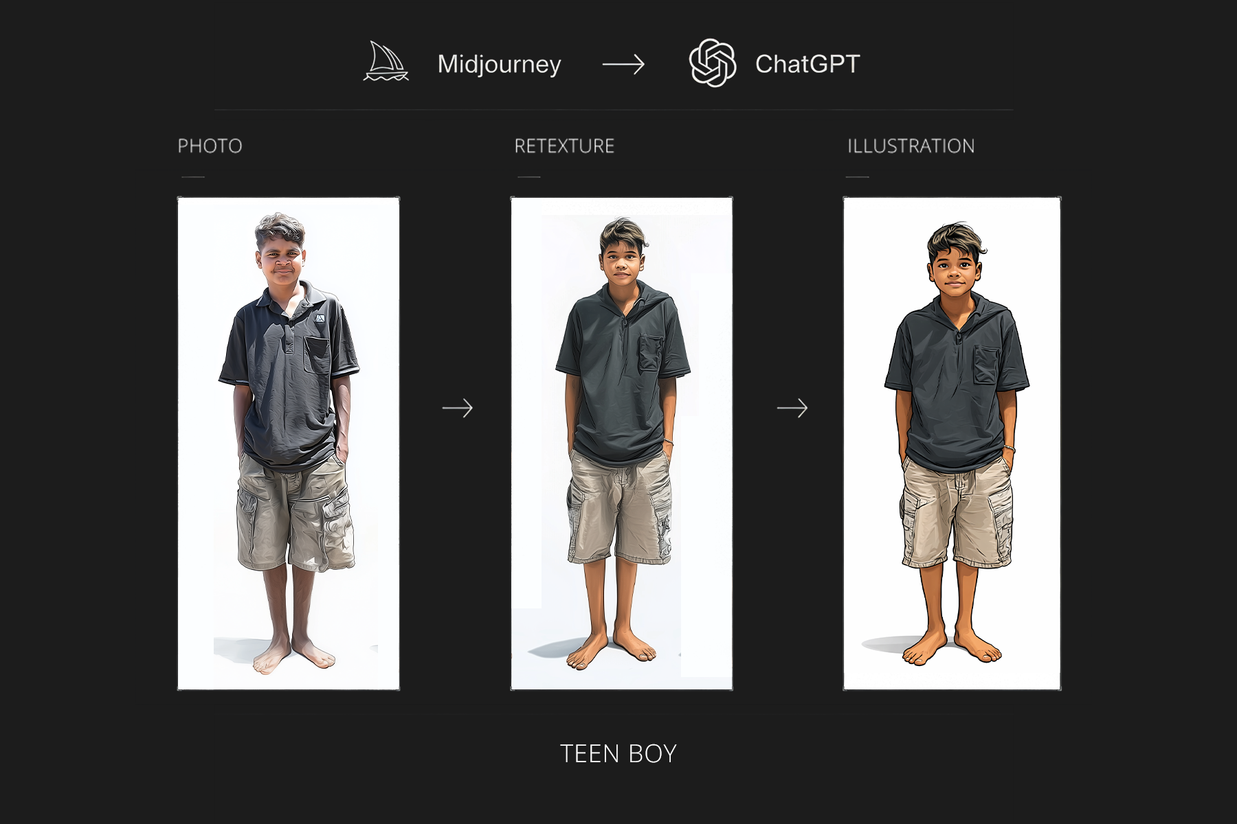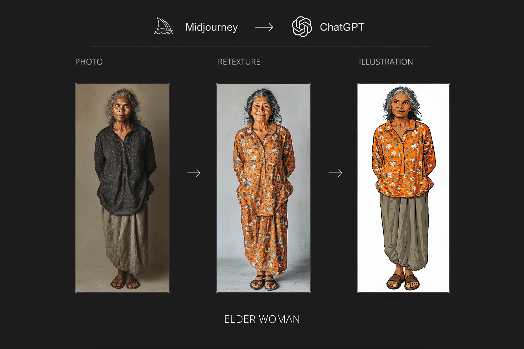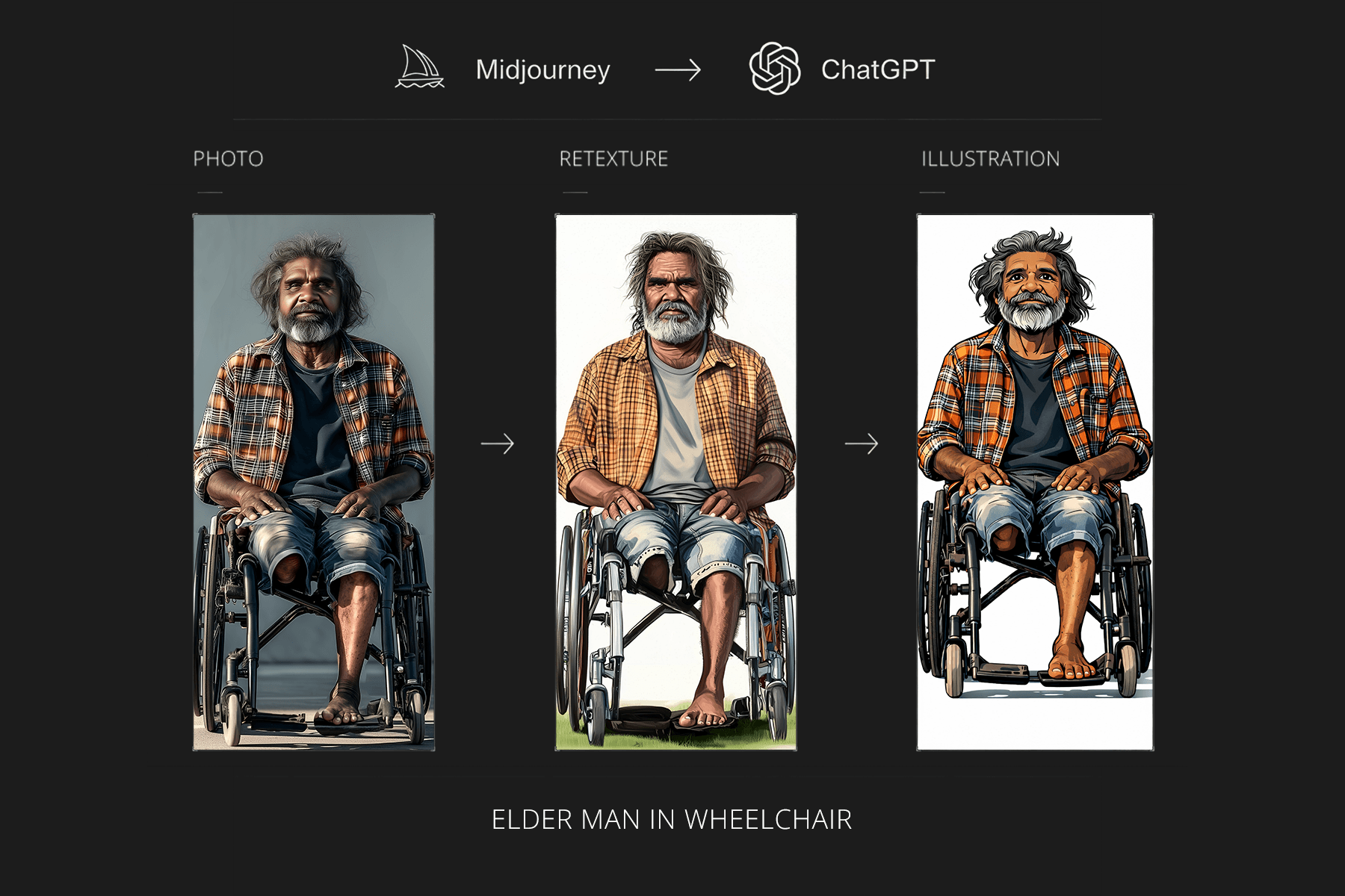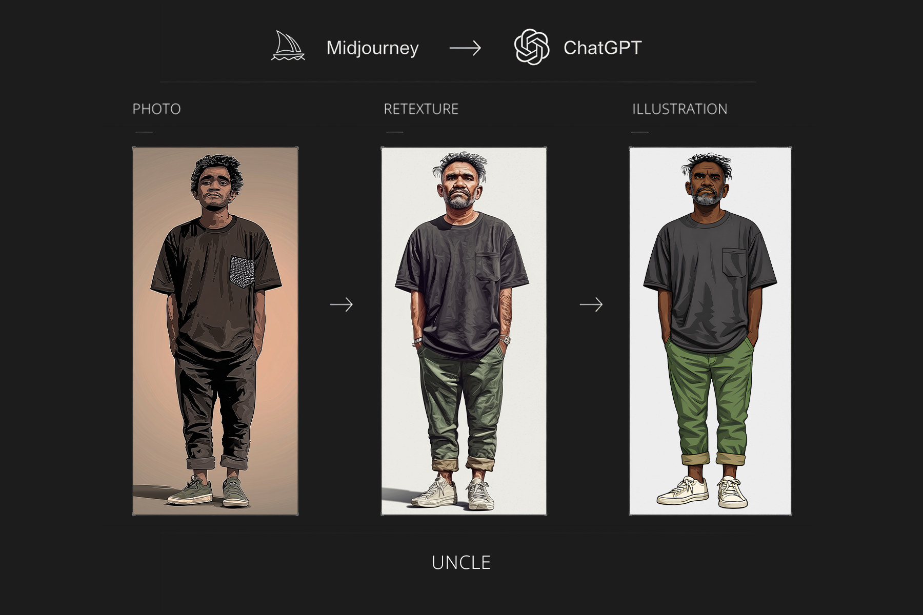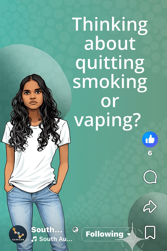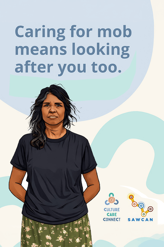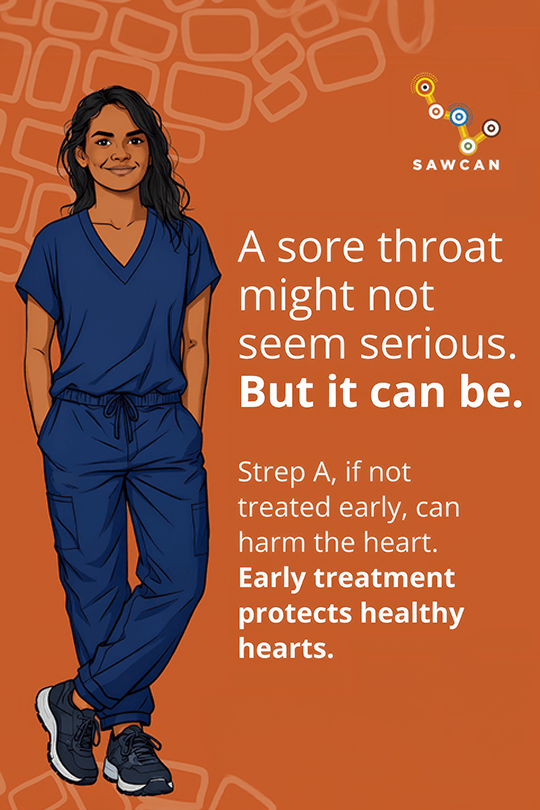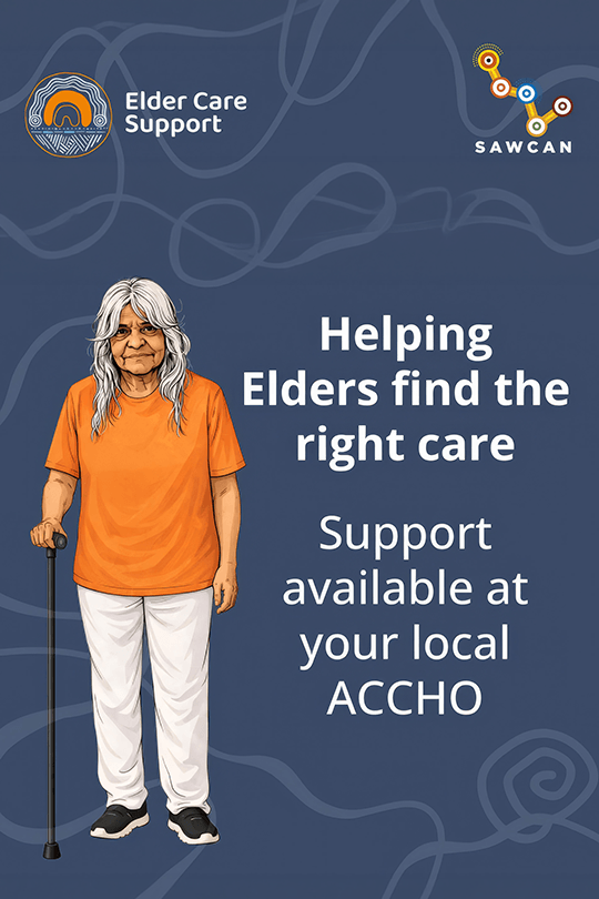
A culturally considered character and medical-icon toolkit for Aboriginal health communications. Developed through AI-assisted concept exploration and refined in Adobe Photoshop and Illustrator for consistent use across digital, presentations and print.
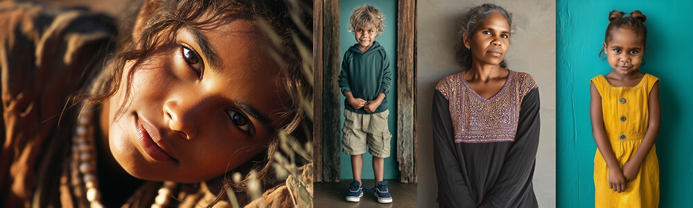
At SAWCAN, I developed a family of illustrated characters and supporting medical icons for Aboriginal Community Controlled Health Organisation (ACCHO) communications. The assets needed to communicate health topics clearly and sensitively across different communities and channels. The design challenge was to create characters that felt warm and approachable without implying that any one illustration represented a particular Aboriginal community or identity. The outcome needed to be a consistent visual system that could support future storytelling, educational content and potential animation, rather than a collection of unrelated illustrations.
Cultural appropriateness shaped the brief from the beginning. Photographic representations of First Nations people were not suitable for this broad, multi-community application, so I explored original illustrated characters instead. I completed Arraru Yakka Cultural Capability Training, led by Renee Andrew née Coulthard, to inform how I approached representation and visual communication. That learning helped guide decisions about expression, visual tone and what to leave out. I planned the characters as a reusable digital asset family, with consistent proportions, visual features and expressions. Each needed to work on its own, in a group composition or alongside medical information. The same approach guided a complementary set of clear, recognisable health icons.
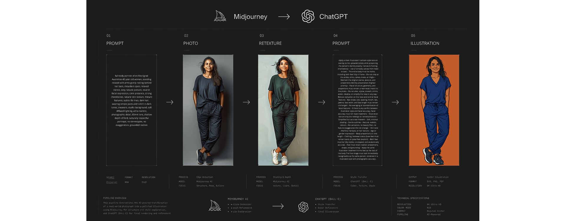
I used ChatGPT and Midjourney to explore visual directions and develop character concepts, then iterated on the results to achieve the intended expressions, consistency and style. I refined the selected artwork in Adobe Photoshop and Illustrator rather than treating generated imagery as finished deliverables. The production work focused on clean edges, consistent proportions, readable expressions and assets that would remain usable at different sizes. I created neutral and positive character variations so the illustrations could support different messages without changing the overall visual language. The material was intended for presentation to SAWCAN directors and ACCHO leaders, so the final artwork needed to be easy to assess, reuse and adapt across communication formats.
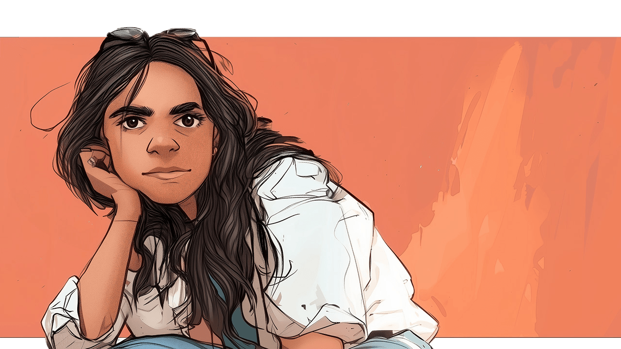
The completed toolkit included individual high-resolution characters with transparent backgrounds, a grouped family composition and a matching set of medical icons. I organised the artwork into an A4 landscape presentation PDF for digital sharing and printed review, with individual assets available for use in other materials. The characters were designed to support health education, NDIS-related communications, presentations and future multimedia storytelling. Careful attention to expression, legibility and visual consistency made the components adaptable across different layouts and audience needs. This project demonstrates how I use emerging visual tools within a controlled design process. The AI-assisted exploration helped develop options, while the final work depended on judgement, cultural consideration and hands-on asset preparation in Adobe software. Although this was an illustration project rather than a finished animation, the resulting character and icon system provides a consistent foundation for digital content and subsequent motion work.
"When I saw your illustration, a sense of calm came over me."