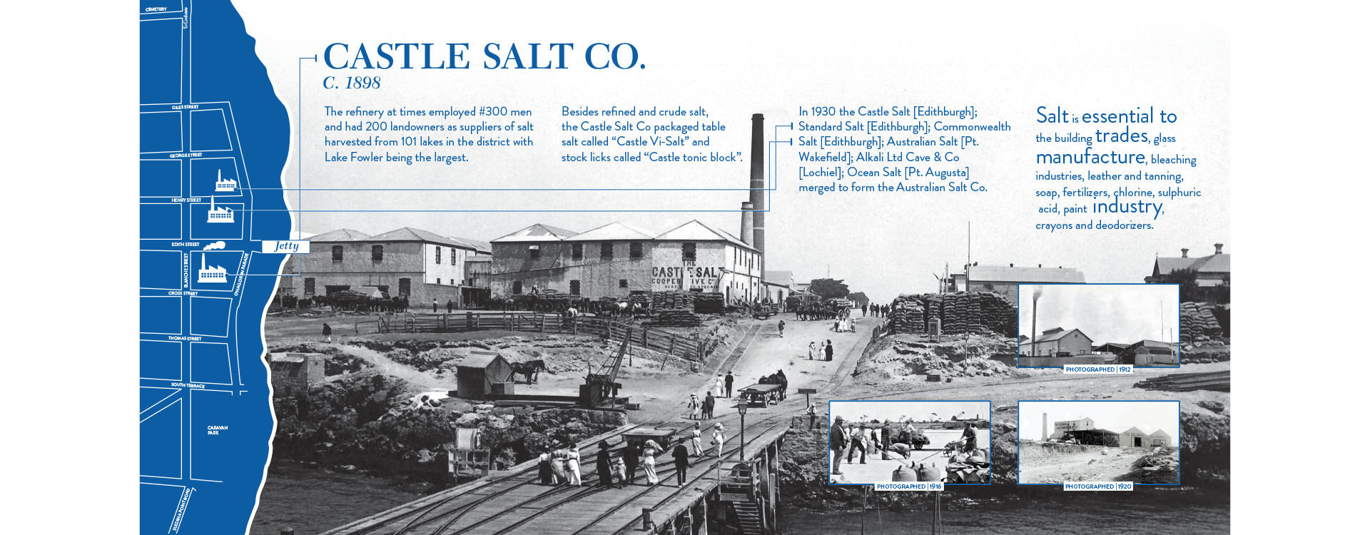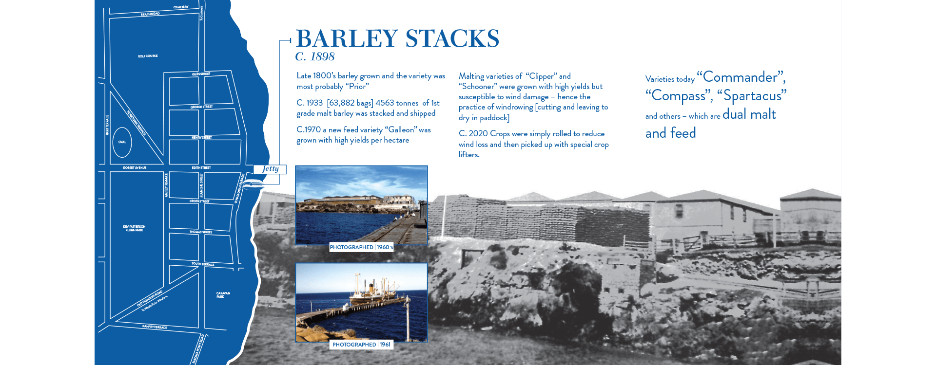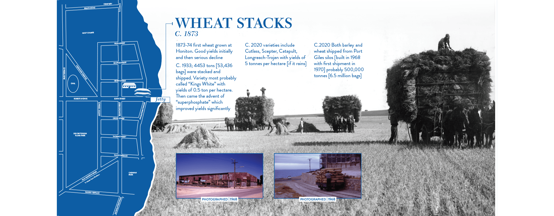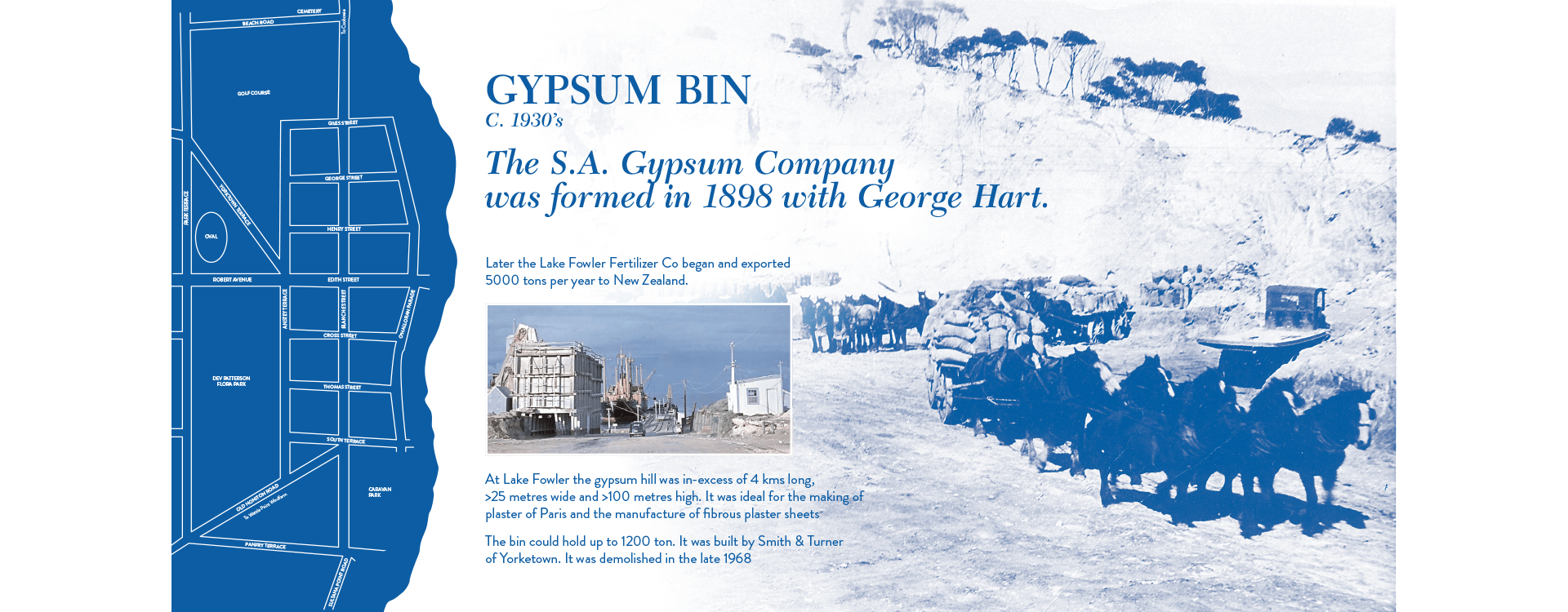
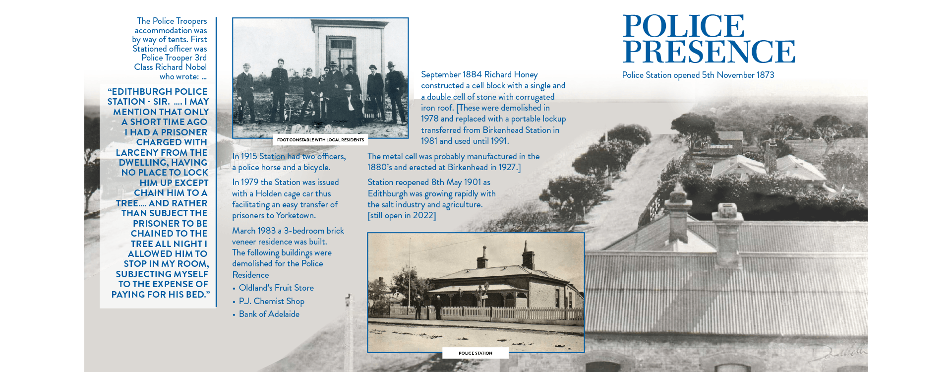
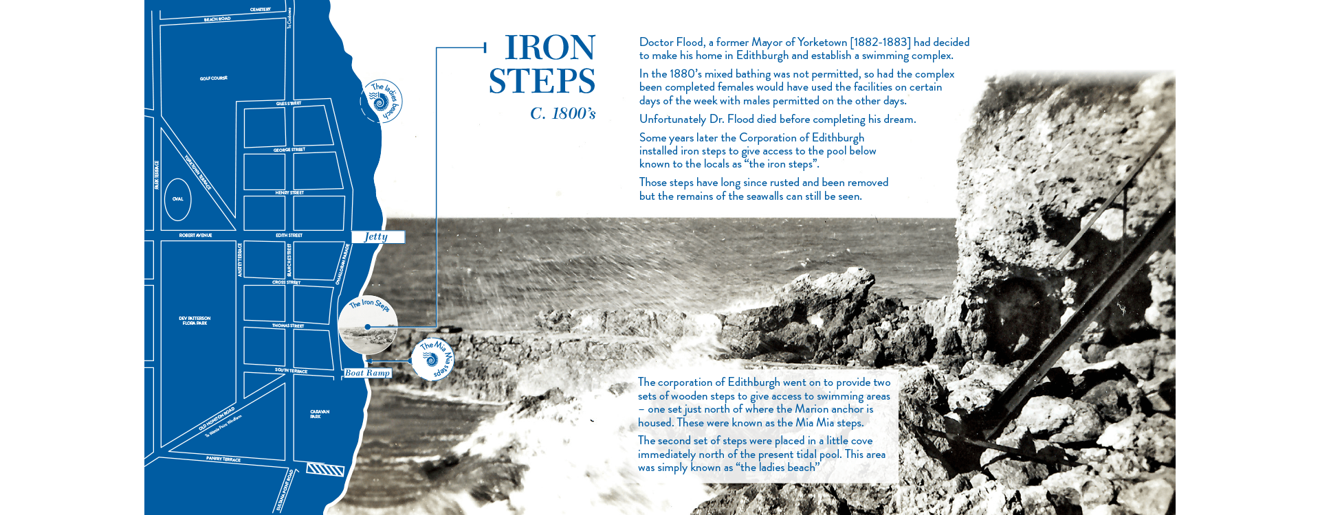
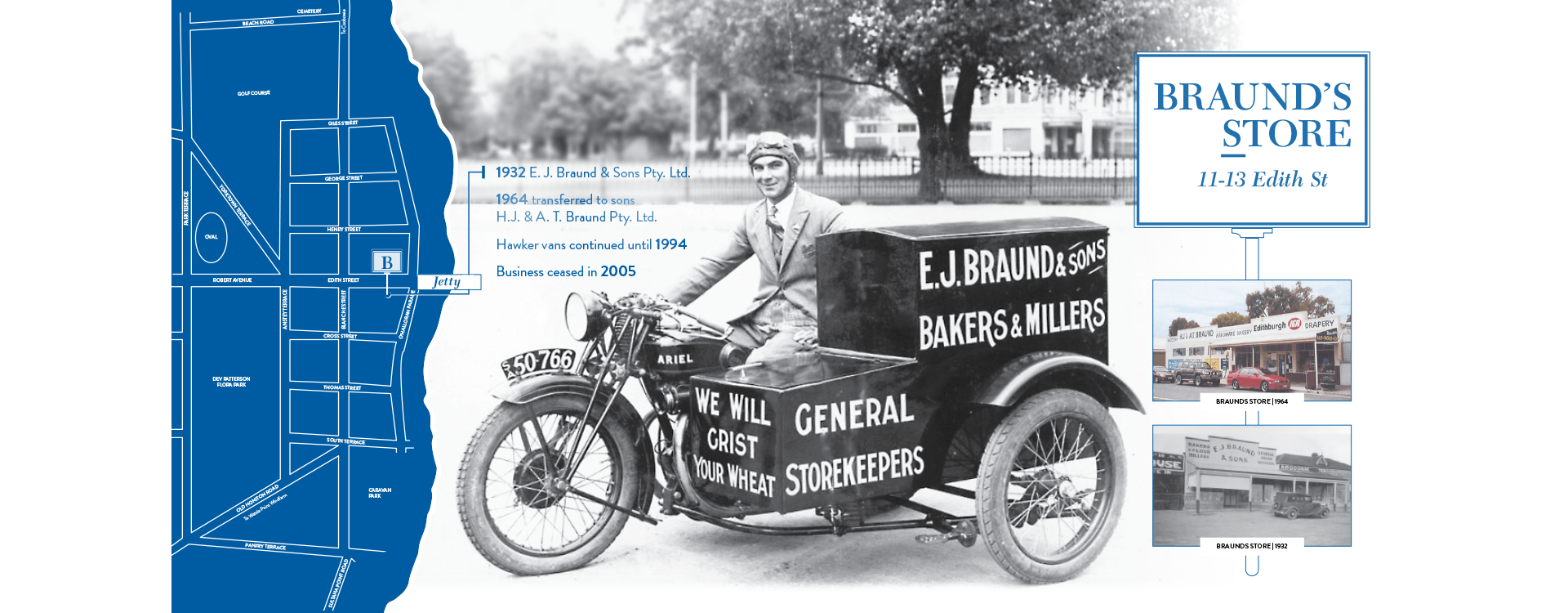
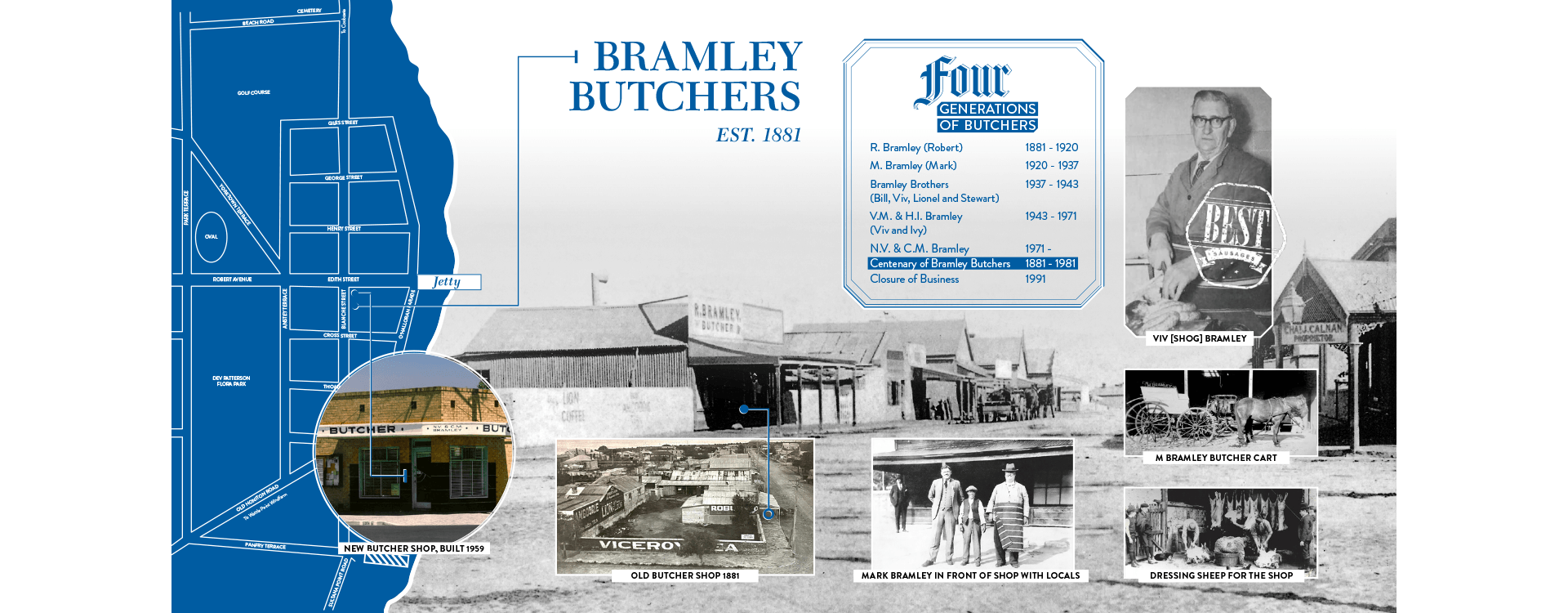
Designing for Edithburgh meant working with history that spans generations. This project translates archival imagery and local stories into signage that invites people to slow down and connect with the place around them.
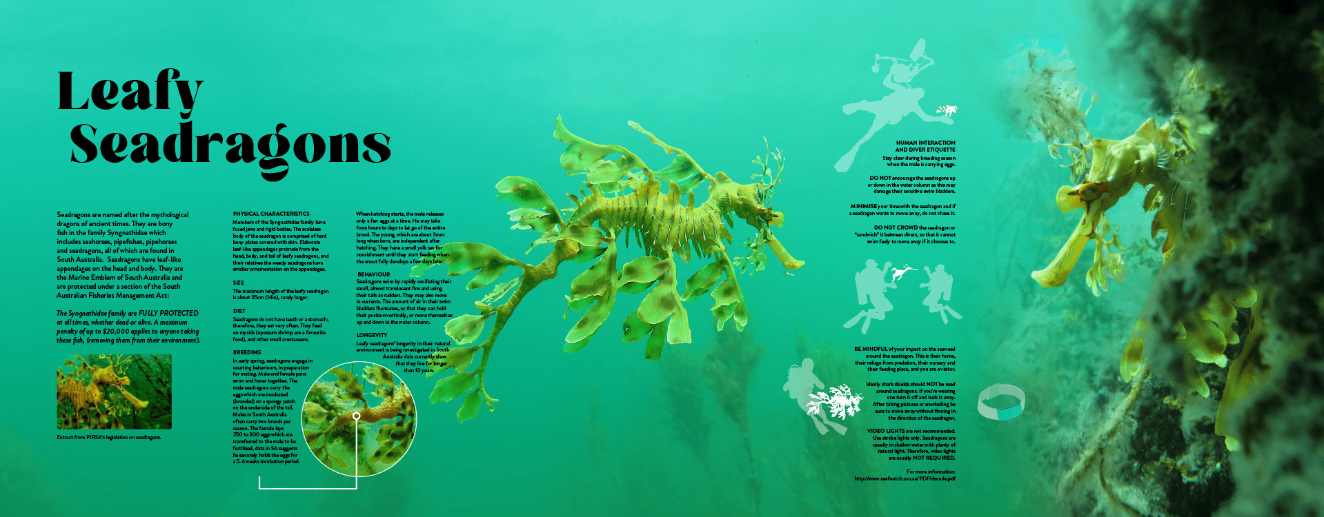
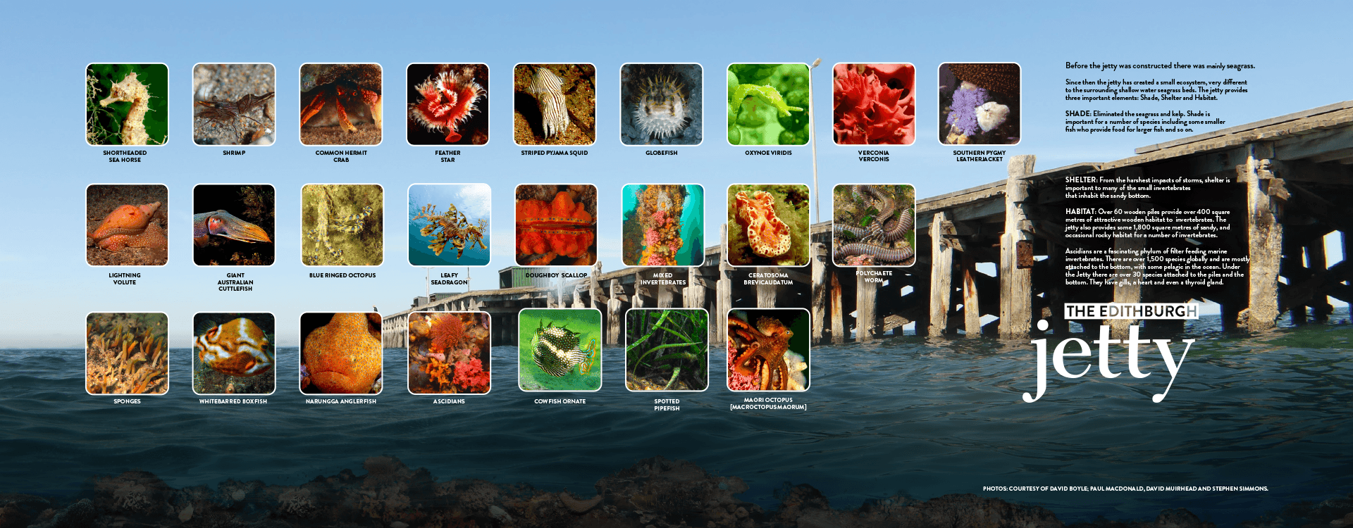

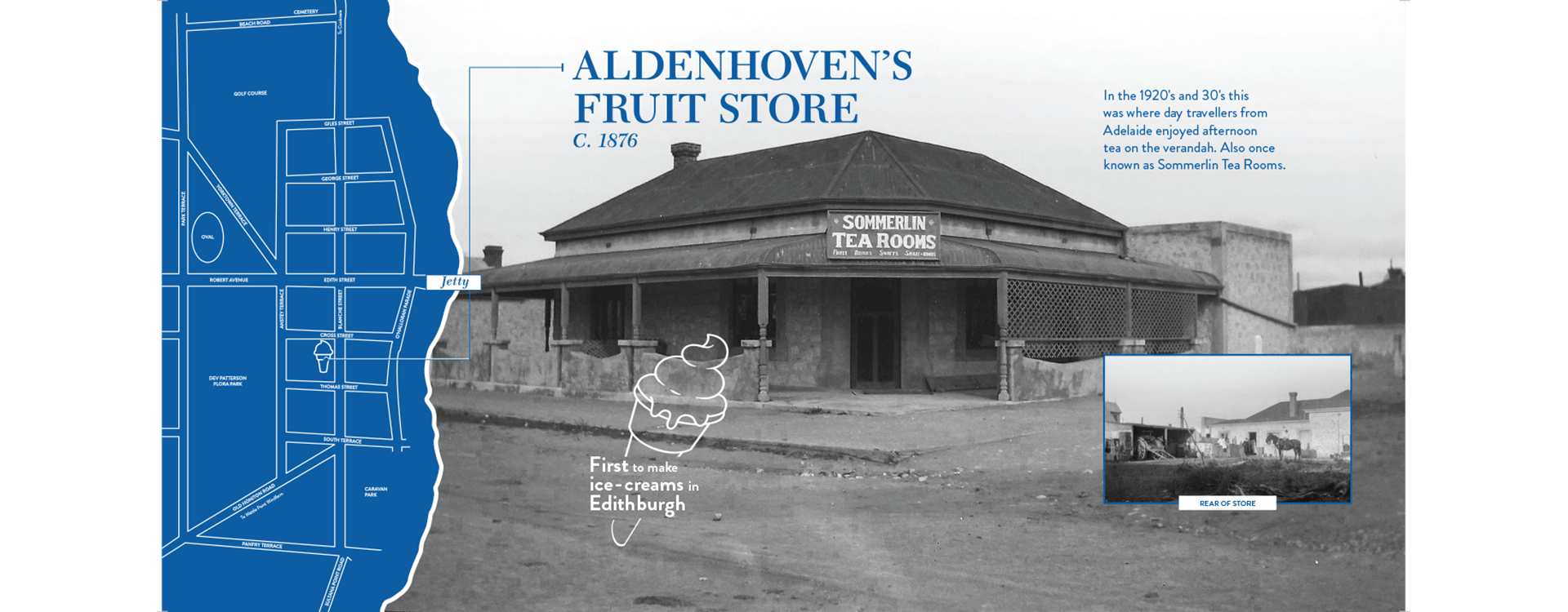
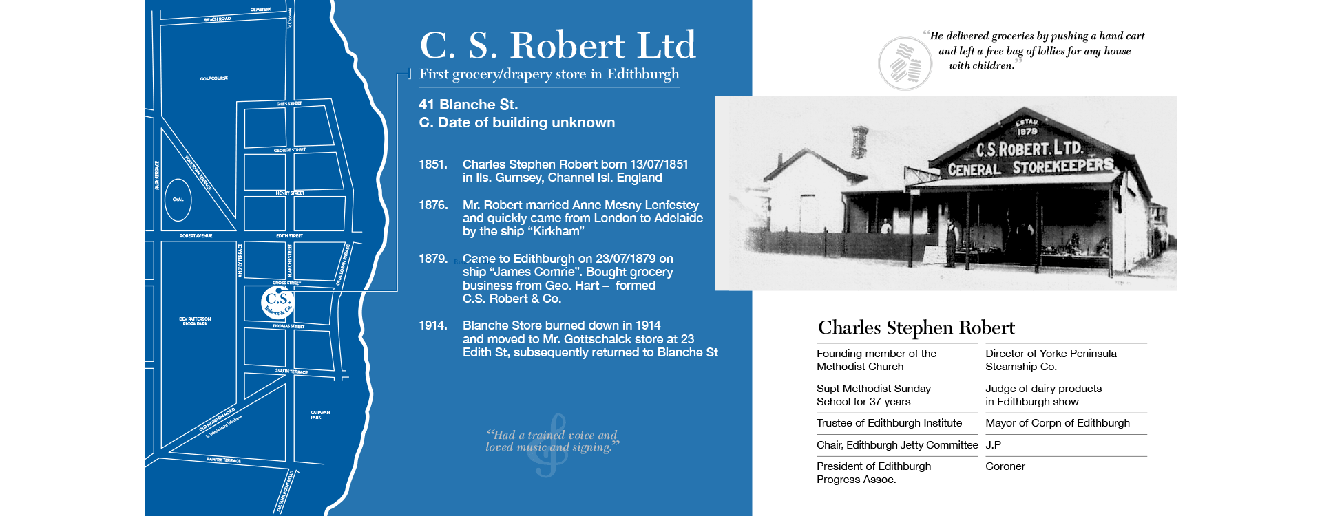
Working with the Edithburgh Heritage Council, I was given the opportunity to design a suite of public signage that would help tell the story of the town — not just for visitors, but for the community itself. What stood out to me early on was the privilege of the material I was working with. Through access to historical archives from the State Library, I was able to work with imagery and references dating back over 200 years. These weren’t just assets — they were fragments of real lives, industries, and moments that shaped the identity of Edithburgh as it exists today.
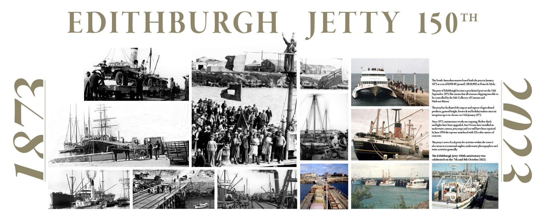
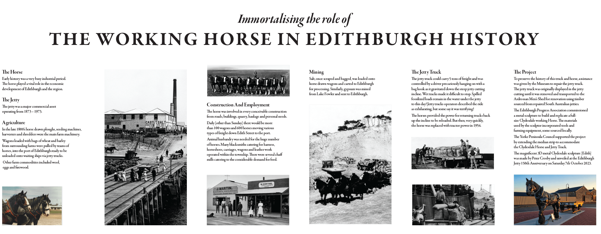
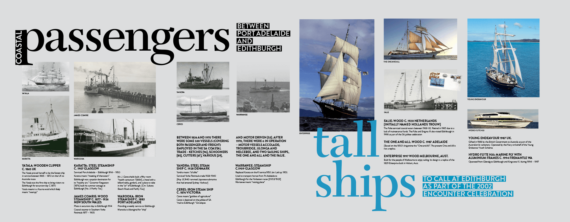
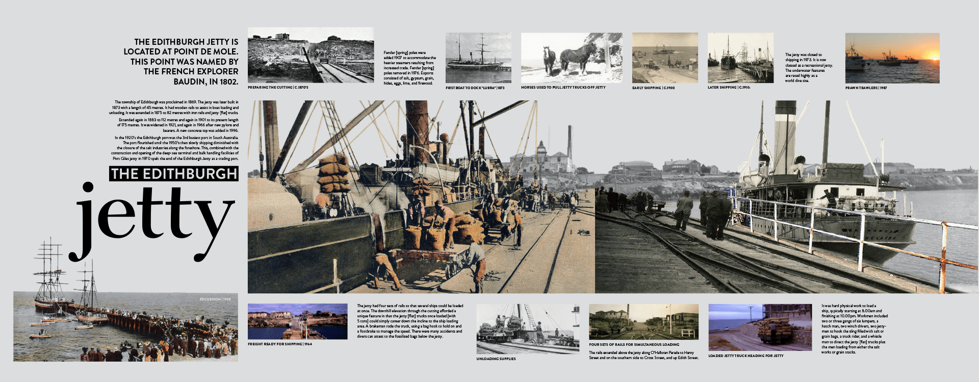
This wasn’t about designing something new for the sake of it. It was about carefully translating history into a format that people could connect with in the present. My focus became finding the right balance between storytelling and clarity. The signage needed to celebrate the town’s landmarks, its history of industry, and the natural environment that defines it — from the working heritage of the coastline to the world-class diving and photography experiences at the jetty reef, through to the protected parks and surrounding flora and fauna. At the same time, it needed to remain accessible.
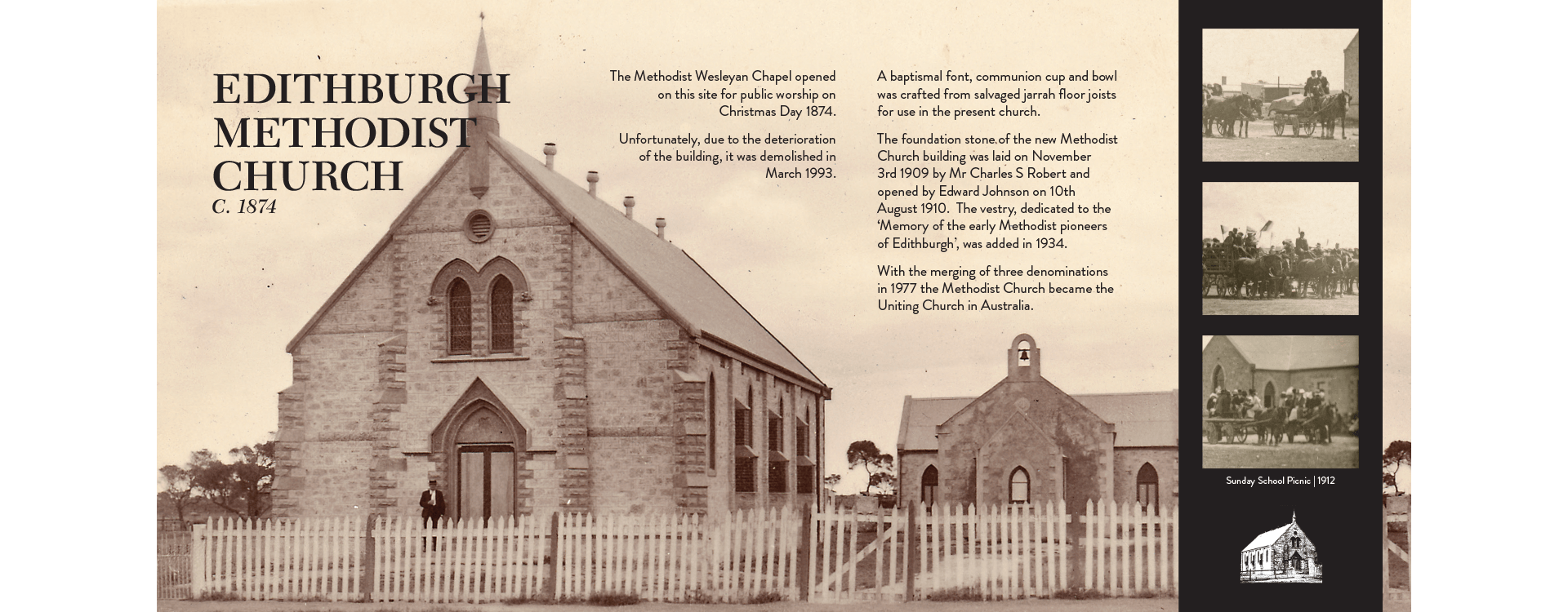
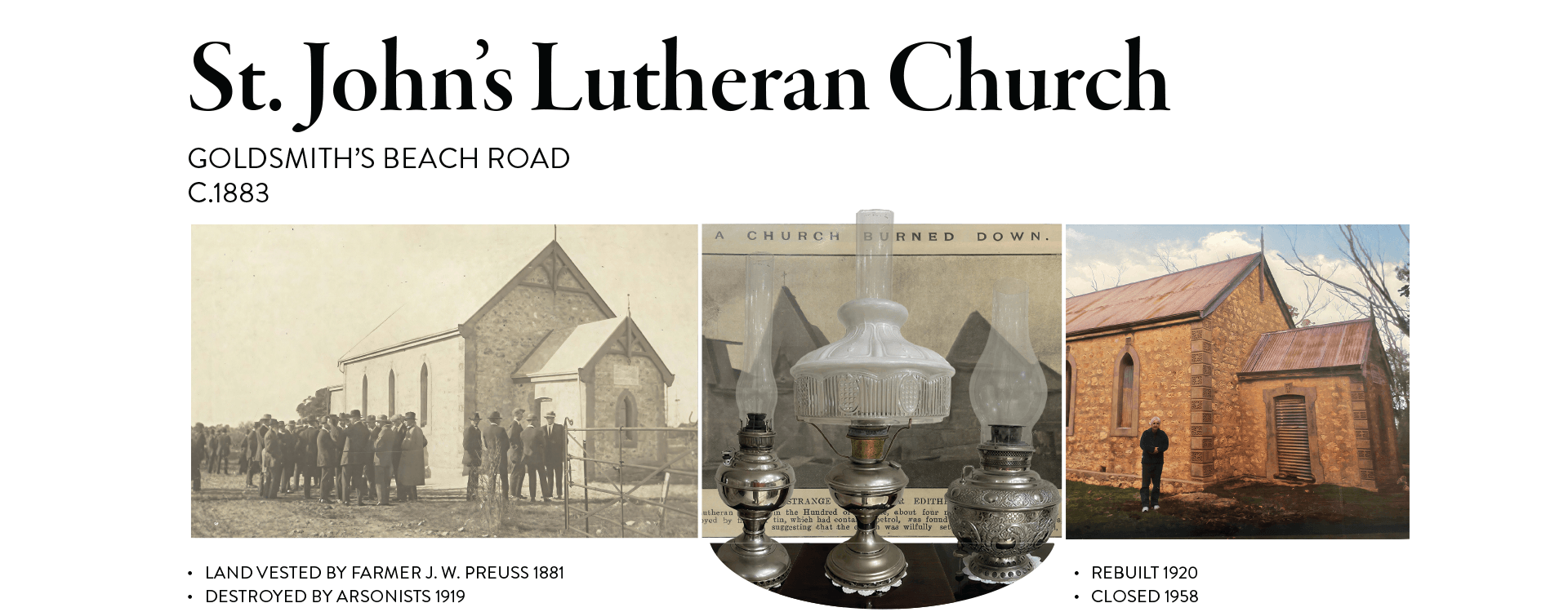
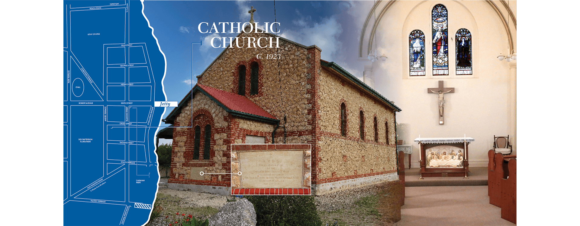
People engage with signage differently. Some pass by quickly, others stop and take their time. I designed the layouts to work at both levels — clear and readable from a distance, with layered information for those who wanted to engage more deeply. Working closely with council stakeholders, I refined the tone so it felt grounded in the community. Informative, but not overly formal. Something that felt like it belonged to the town, rather than being imposed on it. Materiality and durability also played a role. These pieces needed to exist in the environment — exposed to weather, light, and time — so legibility, contrast, and structure were just as important as the visual design.
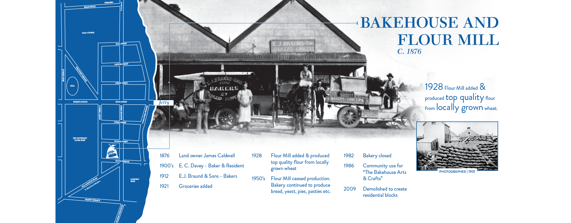
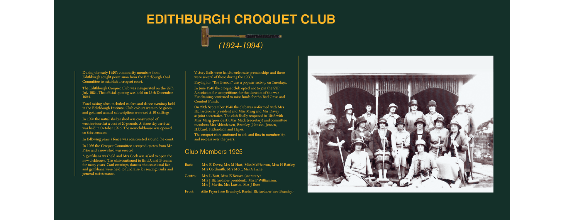
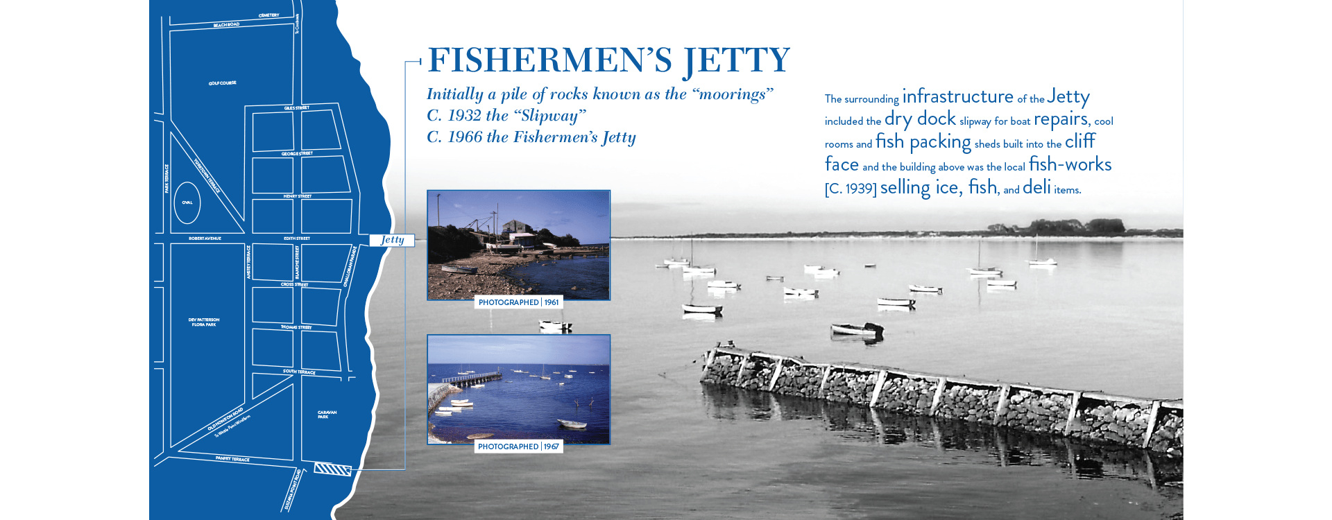
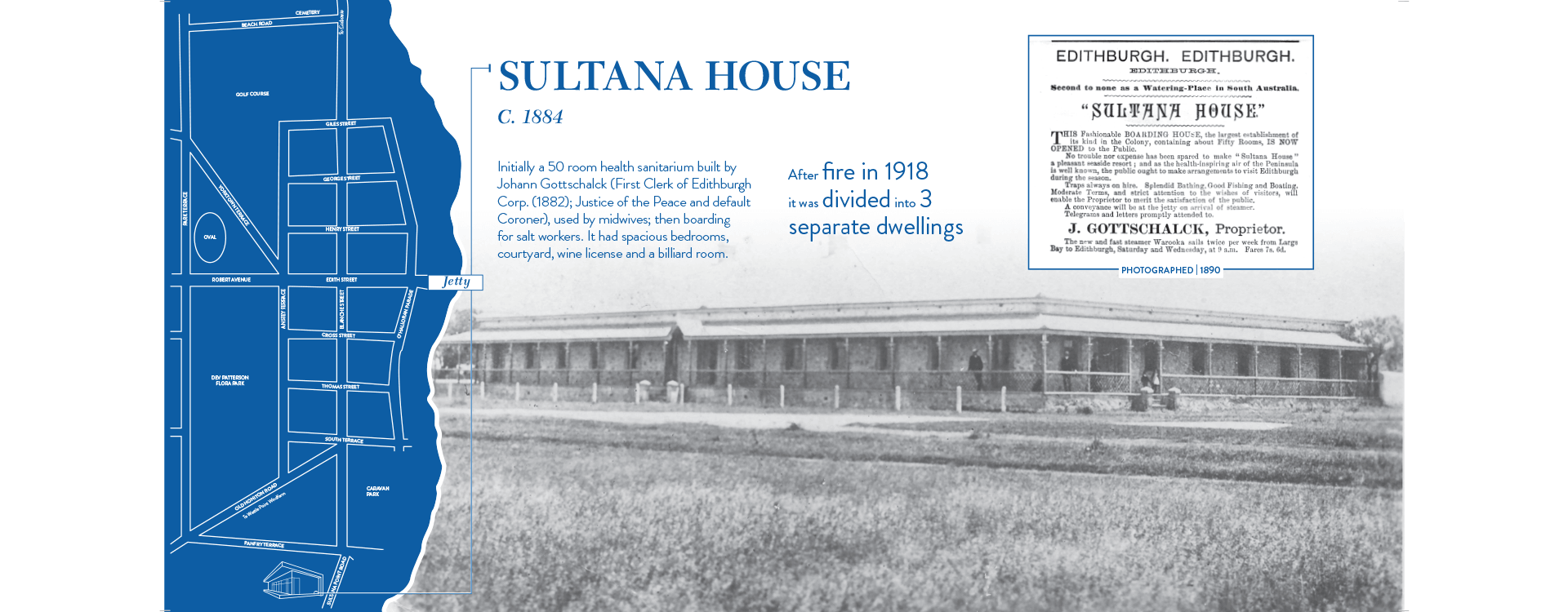
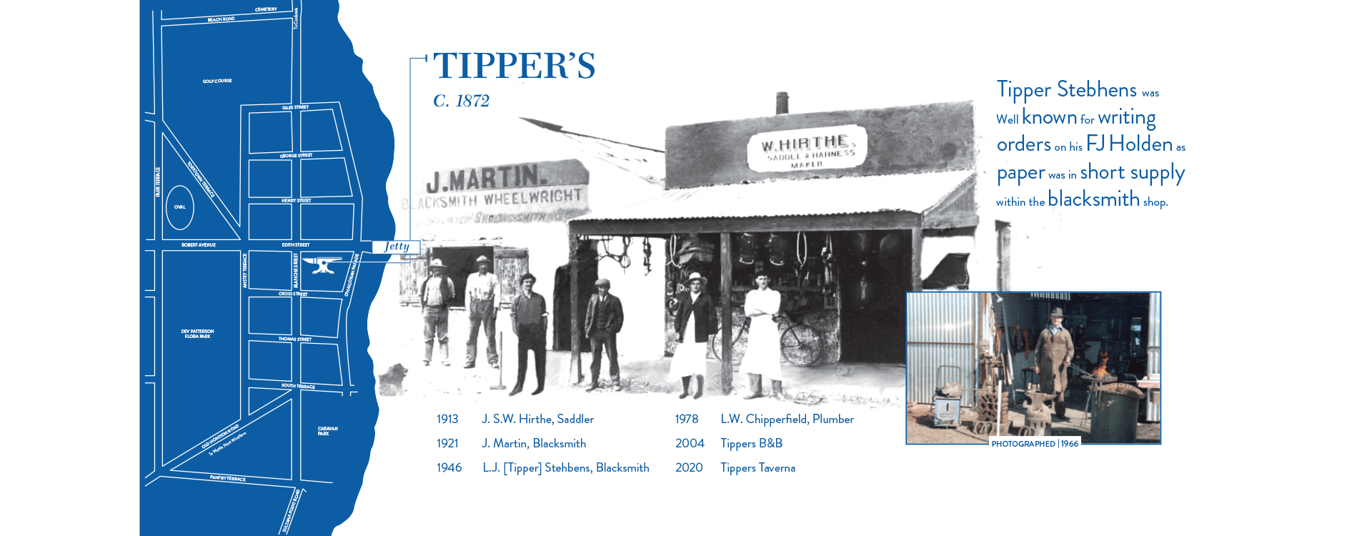
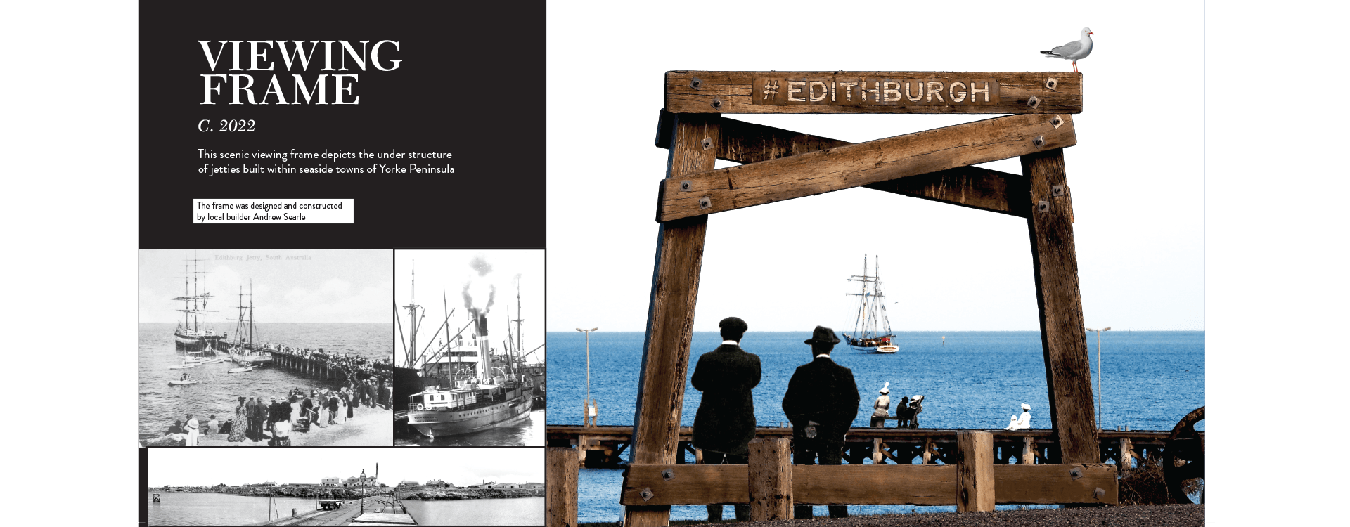
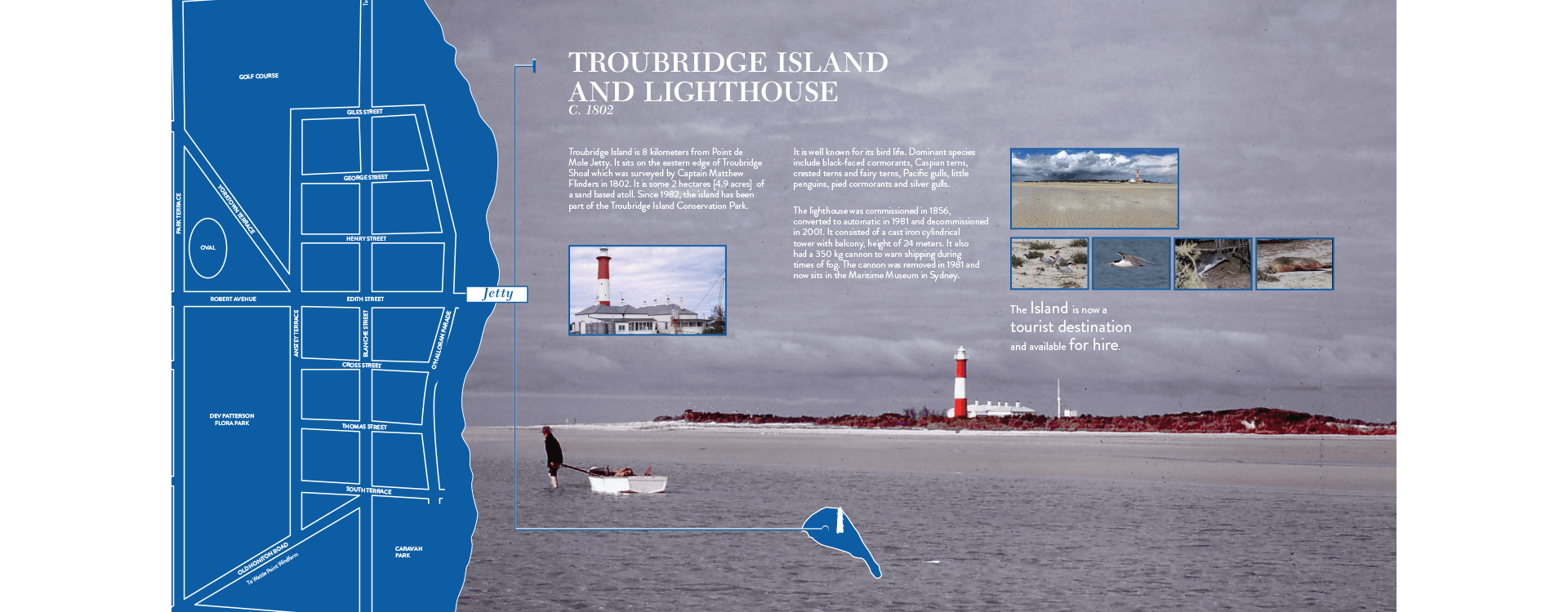
Alongside the signage, I contributed to broader place-based branding, including visual work for the “Day at the Burgh” event, helping to create a more cohesive identity across tourism and community touchpoints. What stayed with me most from this project was the sense of responsibility. Working with history, especially at this depth, changes how you design. It’s less about adding your voice, and more about making space for the stories that are already there. The outcome was a set of signage that celebrates Edithburgh for what it is — its people, its history, and its natural environment — while making those stories easier for others to discover.