
UI/UX redesign and digital asset production for Move Yourself's customer-facing eKiosk. Simplified a booking journey from approximately 18 screens to 10, with clearer navigation, interface graphics, 3D product visuals and direct collaboration with developers.
At Move Yourself, the business was replacing costly physical rental kiosks with a digital self-service experience. The existing process was cumbersome, with customers working through approximately 18 screens to complete a booking. The CEO, Rob Cowie, wanted an approach that would be simpler for customers and easier to extend across the rental network. As Senior Graphic Designer / Marketing Coordinator, I helped translate that direction into a practical interface. My responsibilities covered UX/UI design, user flows, visual assets and collaboration with the software team, rather than back-end application programming.
I mapped the customer journey with the development team and reviewed where users had to make decisions, enter information or move between screens. We consolidated the sequence to approximately 10 screens, refining navigation and interaction behaviour to make the process more direct. I developed layouts, icons, transitions and a consistent interface style using the established black-and-yellow brand palette. Clear typography, visible actions and a predictable visual hierarchy helped keep the application usable on a self-service screen. I also introduced Monday.com as a shared planning tool to help track milestones, dependencies, reviews and deliverables. Regular collaboration with developers meant the interface could be refined as the build progressed, rather than handed over as a static design.
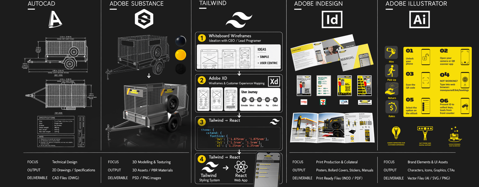
Customers needed to choose a trailer without inspecting it in person, so accurate product visuals were an important part of the experience. Working with source AutoCAD models, I prepared, textured and rendered 3D trailer imagery for use in the interface. I supplied application-ready graphics and contributed directly to front-end implementation using HTML and Tailwind CSS. Working alongside the developers, I reviewed integrated screens, tested interactions and adjusted design assets or styling when the implemented result differed from the intended flow. This combination of UI design, technical asset preparation and implementation review helped keep the customer experience consistent from concept to working application.
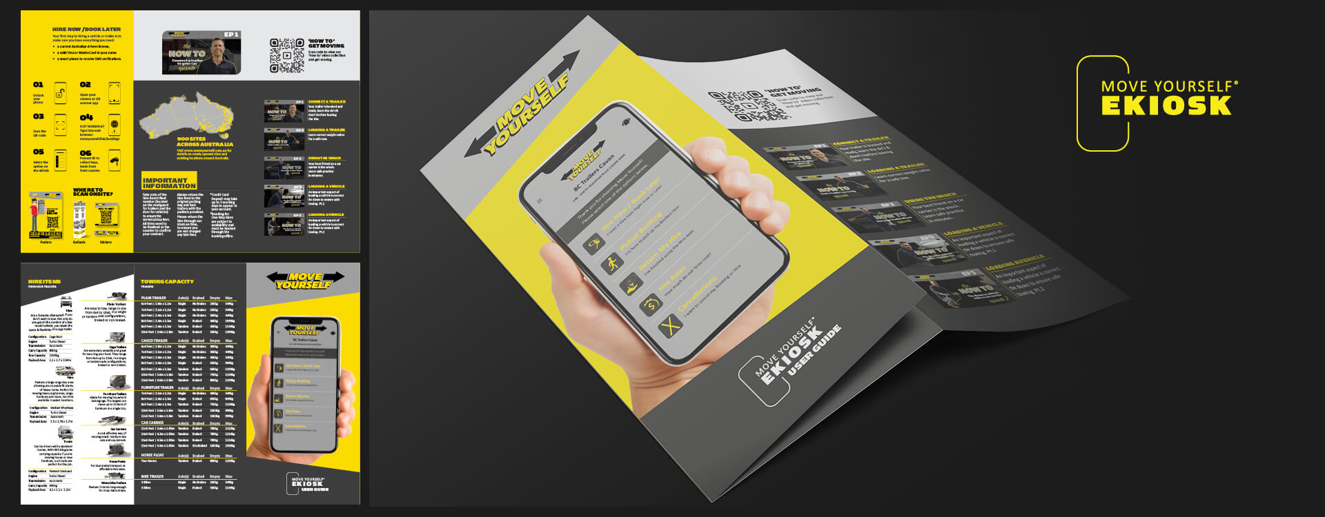
The redesigned eKiosk supported the move towards a paperless, hardware-light rental experience. The wider initiative was projected to avoid substantial physical kiosk investment, while making new rental locations easier to activate. I also worked with the lead developer on a scalable, branded QR poster system. Its automated production process generated location-specific codes and artwork for partner sites, supporting rollout without the need for dedicated kiosk hardware at each location. For me, the key outcome was the working relationship between design and development. I wasn't simply delivering screens: I was shaping interaction flows, producing graphics and 3D assets, contributing front-end styling, and testing the result as it moved towards release. That hands-on collaboration is central to how I approach digital product work.