
UX/UI design for a Data & AI Enablement platform, focused on clearer task flows, readable status information and consistent interface assets. Developed visual solutions that helped technical and non-technical users navigate complex data workflows.
Insight Factory approached me to improve the interface of its proprietary Data & AI Enablement software, used to manage data pipelines, predictive modelling and AI-related workflows. Organisations including Rio Tinto and the Housing Trust were using the platform to work with complex datasets. The challenge was to make a powerful technical system easier to understand, particularly for new or less technical users. The work centred on interface structure, visual clarity and interaction flows, with the goal of reducing reliance on experienced engineers for everyday navigation and onboarding.
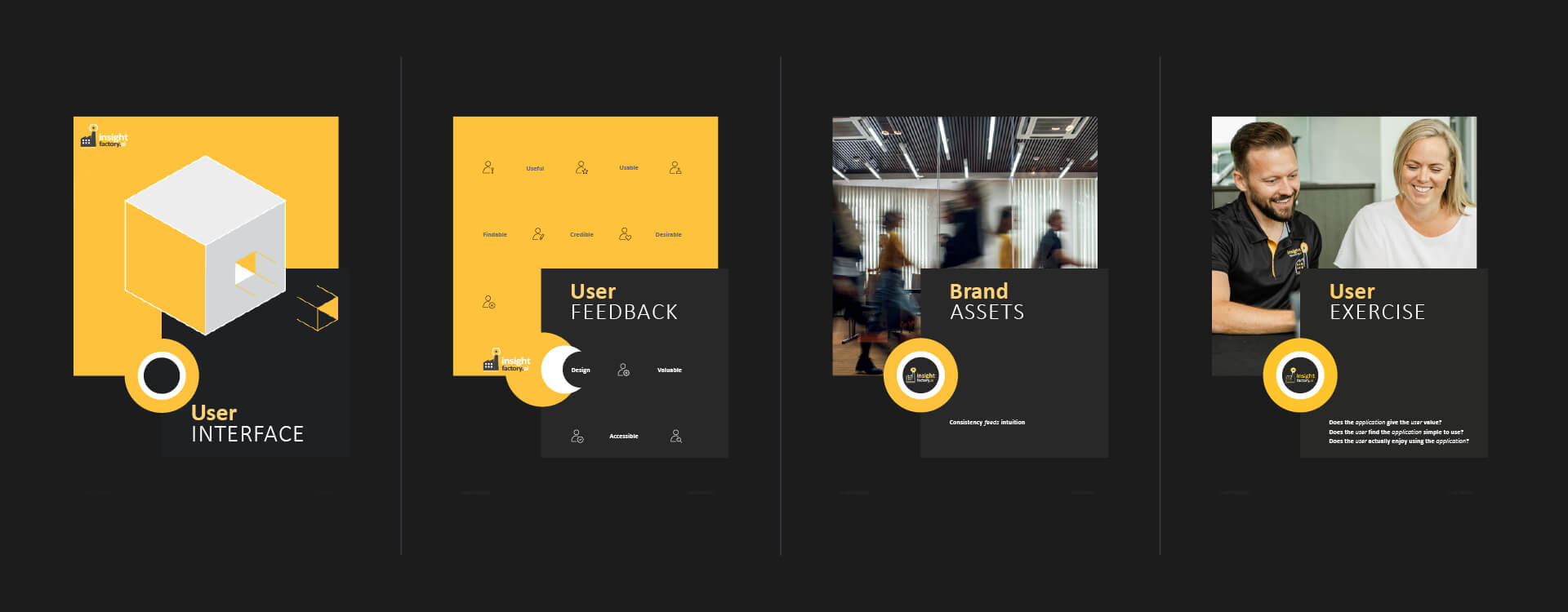
Before redesigning screens, I examined how people moved between tasks, groups and production lines. I developed surveys and feedback exercises with stakeholders and internal users to understand where actions felt disconnected or where users lost track of their position in a workflow. One consistent finding was that users preferred the production-line view because it gave them context. Having to leave that view to create or edit a task interrupted their work and made relationships between processes harder to follow. This research informed a clearer interaction approach: keep relevant controls closer to the work, reduce unnecessary switching between screens, and make status and progress easier to interpret visually.
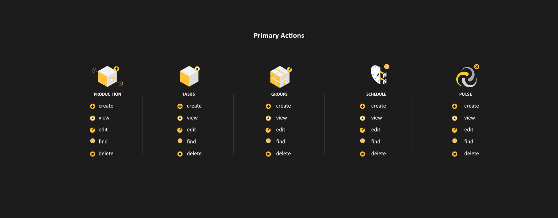
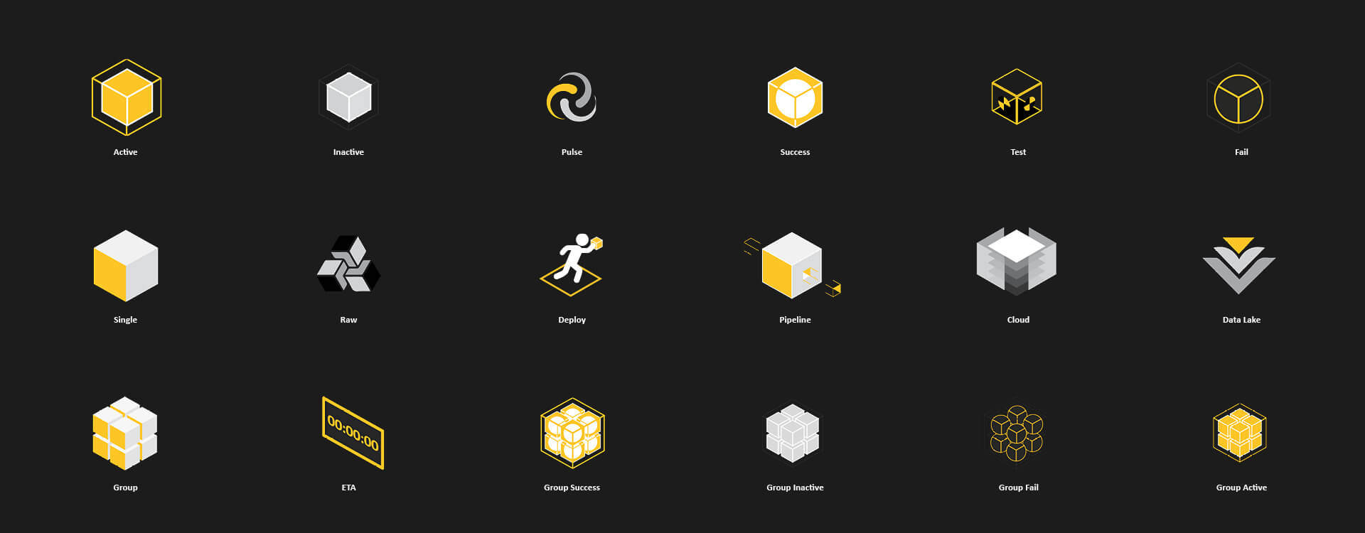
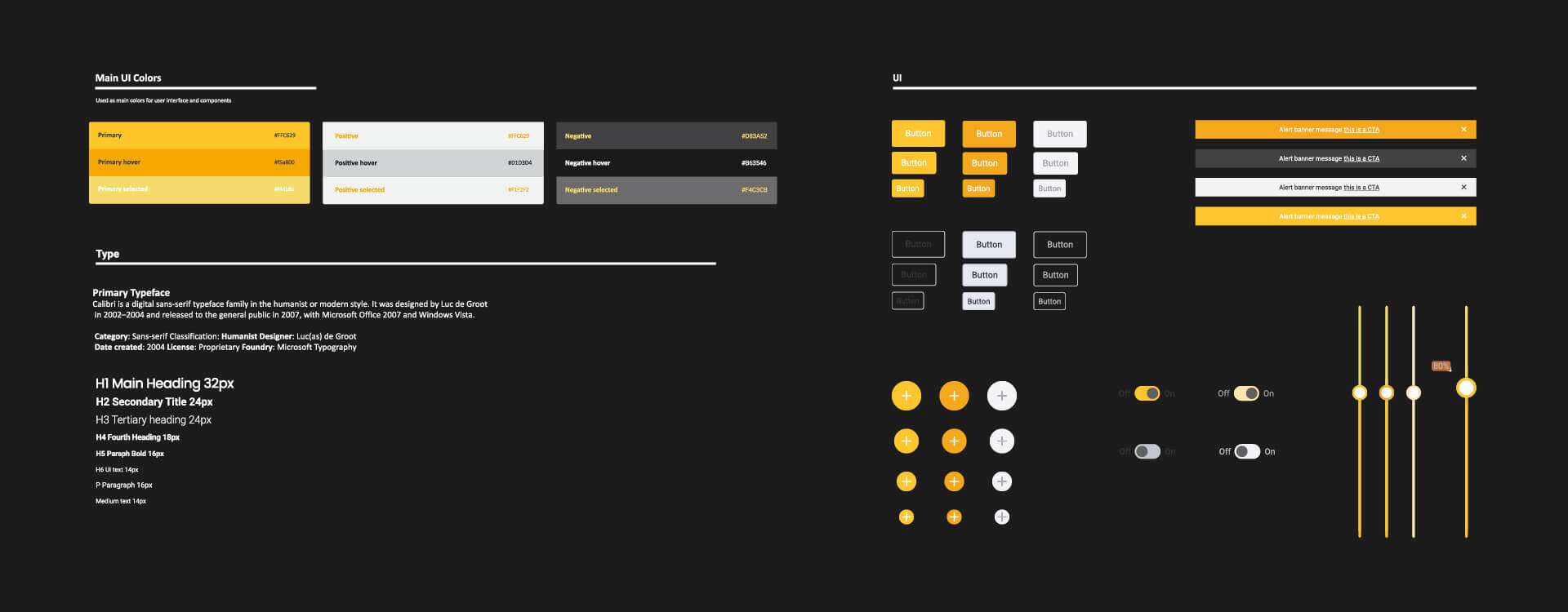
I developed a modular interface language using connected, cube-like elements to represent tasks, their states and relationships. Consistent graphic cues made it easier to distinguish progress, actions and connections without relying entirely on written explanation. The visual work included UI layouts, interface graphics, interaction flows and assets prepared for implementation. I documented design decisions and communicated through product stakeholders with an international development team, so the proposed changes could fit the platform's evolving functionality. Rather than treating screens as isolated compositions, I considered how visual states and navigation patterns would remain consistent as users moved through the software.
Where the design allowed it, tasks and actions were brought into the user's existing context rather than sending them to a different section. This supported a more continuous workflow and helped keep the relationship between data, tasks and production lines visible. As new functions were introduced, I adapted the interface graphics and interaction flows to maintain consistency. The work required balancing user needs with the constraints of an evolving software product, and preparing clear visual assets for the development process. The resulting design provided a more cohesive way to understand complex data operations. Its relevance to multimedia and application work lies in the same underlying disciplines: visual hierarchy, understandable interactions, developer-ready assets and careful iteration.